Hey everybody! Julian here, bringing you the latest news from OgreWare. This is the August 23 Progress Update!
Sometimes the most effective improvements to a system seem incredibly minor. Right now, OgreWare is working on a lot of small tweaks to the UI system that will make the whole thing “read” better – you’ll be able to play more intuitively, with less confusion and clearer feedback from the game itself.

We had gotten some feedback that the “bouncing arrow” over a map tile, indicating that it could be upgraded or built upon, was confusing – people thought it was pointing to the map tile above it, or weren’t sure what the arrow meant at all. The bouncing arrow is now being replaced with a glow effect that will make the tile itself pulse, rather than any icon over it.
(Personally, I was one of the ones who got super confused by that bouncing arrow, and am looking forward to seeing how the glow effect works for this function.)
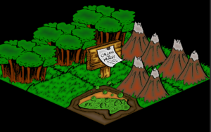
The map tiles are more uniform now, after a quick redraw by me and some editing at OgreWare. They’re all built on the same isometric tile, and parts of them were redrawn digitally to, again, make them more uniform. We think this makes the map a lot smoother and nicer to work with.
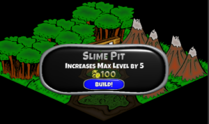
Finally, rather than a full-screen popup explaining about building on map tiles, you get a smaller mini-popup, which we think will help to avoid interrupting the “flow” of your gameplay quite so much.

In my own work, I find that it’s in the fine-tuning – not the initial designs, not the bulk of the work – that you sometimes make the most effective changes to a project. The diamonds are in the details, you might say. Yes, initial sketches are incredibly important; yes, do the bulk of the work, and put your all into it. But really, don’t underestimate those final tweaks. You never know which ones are going to totally transform your project!
That’s about all we have this week. Stay tuned!
~Admin Julian