As we enter the final week before the Mission System from Calling All Heroes is unveiled, I’m reminded that fine-tuning is just as important as the content creation that we call the “bulk of the work.” In making a game, comic, novel, or what have you, fine-tuning is a process that we too often rush. At least I do. But it seems that those who do fine-tune their work prevail as the creators of truly great content. Let me give you an example.
Some of you may know already that I am a manga/comic artist. Comics, manga, and graphic novels – sequential art – are sometimes called “the invisible art,” because when people read a comic, they blow by the pages at great speed. Most of the images barely get a second glance – and yet this is indeed an art form, and requires precision and consistency that some other art forms can (sometimes) get away without. It’s all well and good to draw a character in a striking way – but does it read clearly?
An aside: In graphic art and design, the term “read” refers to how an image or scene translates in the viewer’s mind. An image that “reads well” communicates a lot of information – character, action, movement, scenery, mood, etc – without any elements actually jumping out and interrupting the flow of the viewer’s imagination.
So when I draw my comics, above all – beyond good composition or dramatic poses, beyond even pretty pictures – I have to make sure that my work reads well. All the art skill, fancy materials, and even good writing in the world won’t save you if your images don’t read clearly.
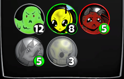
And as OgreWare is completing the Missions system, I’ve seen them work on making parts of the Mission UI read well too. (Yes, video games are similar to comics in a lot of ways – including the fact that small decisions and adjustments can change how the whole thing reads in a big way.) The main area where I’ve seen this is the way that Troops are portrayed within the Mission UI. Take a look at the image below:

In the closeup, you can see different colors on the beveled borders around the little Troops. In this case, a gray outline means that the troop can be sent on that mission, and has neither an advantage nor a disadvantage in that environment; a green outline means that they have an advantage there; red means they have a disadvantage. Gray with a black outline means the troop has died on a mission and needs to be revived, and gray with a gray outline simply means that the troop is on another Mission already and therefore cannot be assigned to this one.
The color in the background of the level circle has significance as well: A green circle means that the Troop is already at its max level and therefore can’t gain any more XP at the moment, and a black circle means that the Troop can still gain some XP. This allows you to quickly see which Troops would benefit most from a Mission that gives out XP – which of course often leads to a cost-benefit analysis of “do I send the Troop who gives me a better win chance, or the Troop who can still gain some XP?” Yet another layer of strategy.
In practice, this means that at a glance, you can see who’s going to be good on a mission, who’s not, who’s dead, and so on. Important information, conveyed clearly without any of the elements standing out so much that they distract from how the whole thing reads.
That, my friends, is an example of a UI that reads well.
If you’d like to see this (admittedly very abstract) idea in action, check back next week when we will be integrating and announcing the Missions system! See you then!
~Admin Julian