This week, OgreWare had me redesign 30+ map tiles – isometric square sections of the map used in CAH – and luckily, I’m pretty quick with a dip pen, so that’s all done. I did want to talk a little about what we’re working on and why I’m re-drawing 30+ map tiles, when they were done before.
The main reason is logistical in nature. The map in CAH is isometric, meaning that it’s based on squares, but from a 3/4 angle, and from 3/4 angle above. Basically it means that rather than seeing a square from a bird’s eye view, you see diamond-shaped pieces – tiles – that make up the whole map. These tiles, ideally, would each be exactly at the same angle, and the same size, so that the map fits together nicely, like perfectly square tiles on a kitchen floor or perfectly cut jigsaw pieces.
Mine did not. My original set of map tiles was all eyeballed, and occasionally traced – never actually measured against an objective, predetermined template – so they didn’t line up perfectly. This resulted in some poor person at OgreWare having to resize, skew, twist, and generally fuss with every single tile to get them all close enough that the map would work. And due to my errors in making those tiles, they ended up having the occasional gap between tiles – which just looks bad.
There was no other option; the map tiles had to be redone. Or at least redesigned to fit a standardized size and shape.
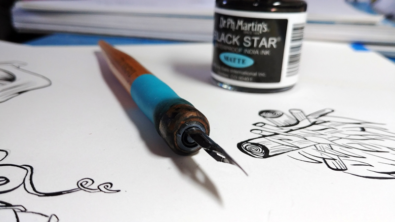
Another reason is some things get lost in translation. For example, when an traditionally rendered (ie paintbrush or pencil or pen, etc, on paper, cardstock, Bristol board, etc), is scanned, it never looks quite as smooth in the digital world as it does IRL. I could go into the specifics of how scanning artifacts come to be, how our eyes perceive paper differently from pixels, or what DPI and PPI mean, but a) they would bore you and b) I don’t really know them.
So, for the commoners out there, let me put it this way: Scanning messes up the image. It’s a great way to get an image into the computer, but you have to have a certain basic amount of skill to get the image to look as nice on the computer as it does on the original paper. There are a lot of ways to deal with these issues and I knew exactly none of them the last time I made map tiles.
Between the scanning issue and the isometric measurement issue, our old map tiles look something like this:
Not terrible. Interesting. But not great. Not fantastic.
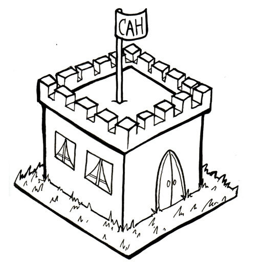
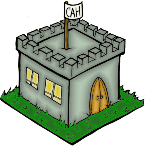
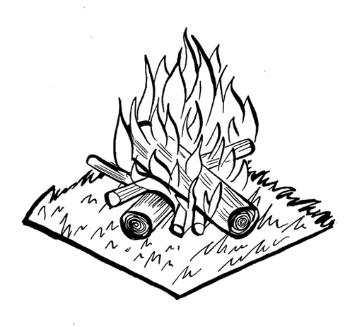
So over the past week, I’ve redrawn every single map tile in the game, and have re-inked them all on a different paper that scans better, and have scanned them with a better scanner. Here’s some examples comparable to the ones previously shown:
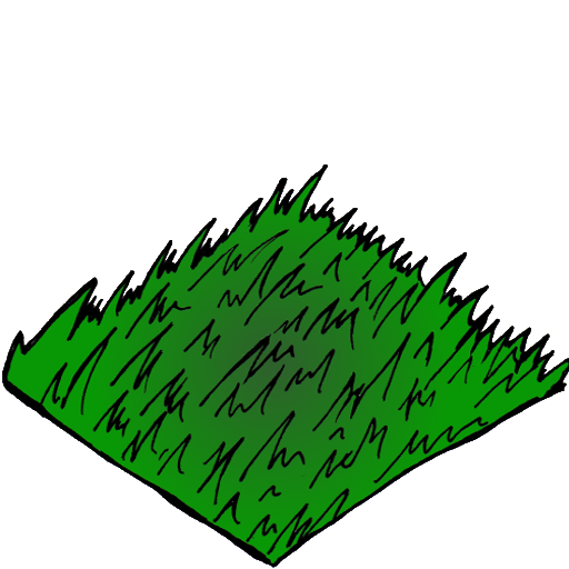
They’re all done on the same template, at the same angle and size, and are actually all mounted on the same grass tile. It’s taken some time, but I feel it’s been 100% worth it.
What do you think of isometric maps? Isometric pixel art? The word “isometric” and how fun it is to say?! Leave a comment below!
~Admin Julian


